# Foundations of minimum viable issuance
When discussing issuance policy, it is important to recognize that staking is a service, and performing it comes with costs to the home staker, node operator, and delegator. This post will take a closer look at the dynamics of cost and surplus in staking, demonstrating how all token holders can benefit from reduced issuance. Two weeks ago, [Martin suggested](https://x.com/koeppelmann/status/1774897086493794467) that changing the issuance curve just shifts incentives from one group to another, and thus creates no value. The quote is a good starting point for the discussion. Modifying Ethereum's issuance policy is critical for several different reasons---and at the very foundation, it *creates value* by reducing total costs for users. The figures in this post come from my recent [ethresearch post](https://ethresear.ch/t/reward-curve-with-tempered-issuance-eip-research-post/19171), suggesting that Ethereum should adopt a reward curve with tempered issuance.
## Cost and surplus
Review the figure below from [Section 2.1](https://ethresear.ch/t/reward-curve-with-tempered-issuance-eip-research-post/19171#h-21-user-utility-9), featuring a hypothetical future supply curve in blue. The supply curve indicates the amount of stake deposited $D$ at various staking yields $y$. It captures the implied marginal cost of staking. What that means is that every ETH holder is positioned along the supply curve according to how high cost they assign to staking, with their required yield implying that cost. Relevant costs include hardware and other resources, upkeep, the acquisition of technical knowledge, illiquidity, trust in third parties and other factors increasing the risk premium, various opportunity costs, taxes, etc. The area above the supply curve indicates the stakers’ surplus (what they actually gain) and the area below the supply curve the costs assigned to staking (the marginal staker would not stake at a yield below the supply curve).
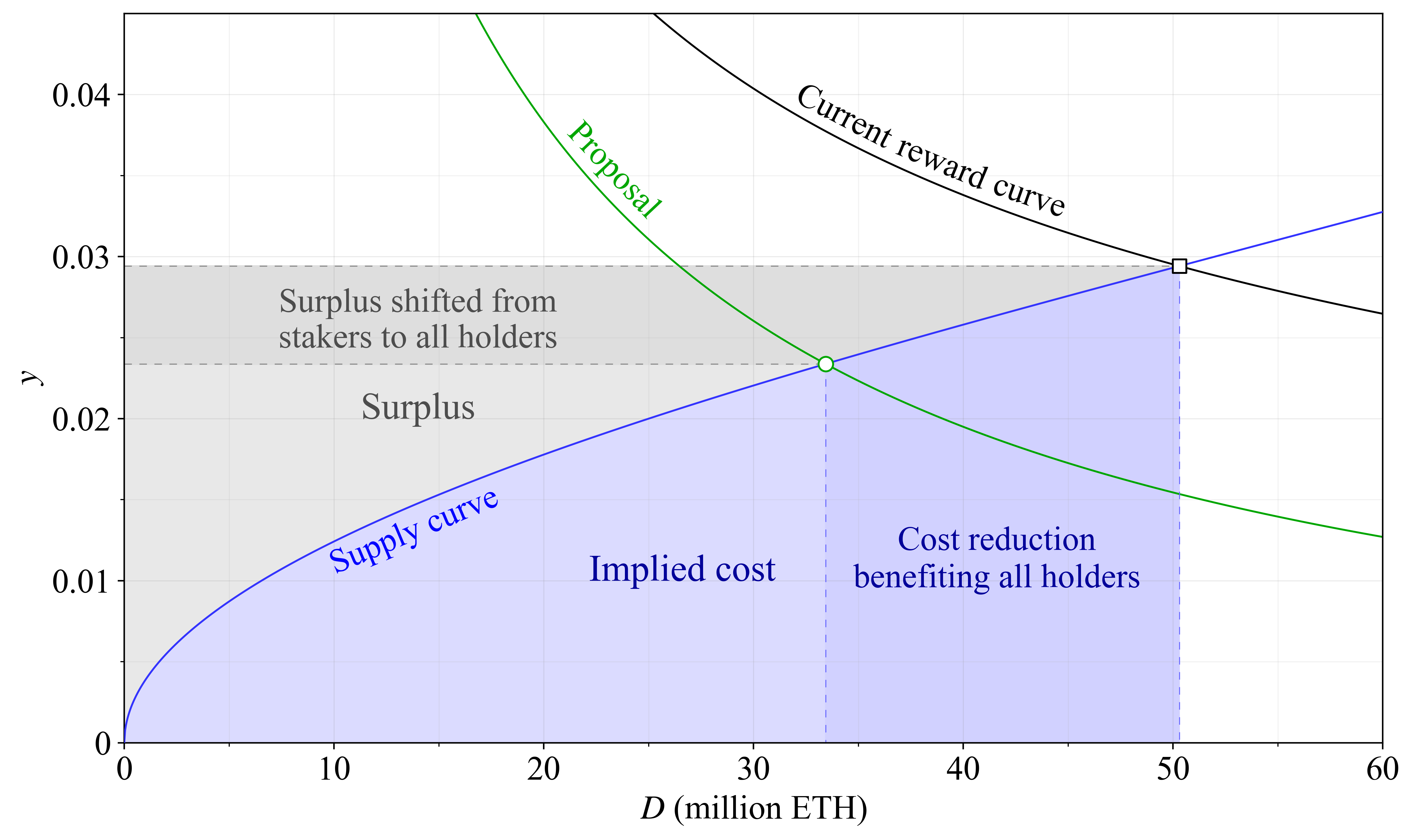
Two reward curves are shown, both under the present level of MEV (300k ETH/year). By maintaining the current reward curve in black, Ethereum compels users to incur higher costs than necessary for securing the network. Adopting the proposed green reward curve eliminates the costs represented by the dark blue area (around 450 000 ETH), thus improving welfare. The issued ETH covered for hardware expenses, taxes, reduced liquidity and risks that users would choose to sidestep under a lower yield. With the green curve they can, and the benefits are shared by everyone (including remaining stakers), creating value for all token holders through a reduction in newly minted ETH. It may seem strange that it matters how many new ETH that are created. But imagine if every ETH was converted to 10 ETH tomorrow so that there were 1.2 billion instead of 120 million ETH in total. Then every ETH would be around 10 times less valuable. What matters is the proportion of all ETH that you hold; a concept that we will get back to. There is also a surplus shift from stakers to everyone from a change in issuance policy, indicated by the darker grey area. That ETH indeed previously benefited stakers, since it was taken from everyone (in the form of newly minted ETH), and then given specifically to them.
### Effect on stakers, de-stakers and non-stakers
What happens here to everyone involved in terms of utility? There are three categories: the remaining *stakers*, the *de-stakers* between the green circle and black square on the supply curve, and those who were *non-stakers* already from the beginning. As mentioned, everyone is rewarded with a proportional share of the combined dark blue and dark grey area, in the form of a reduction to the circulating supply inflation rate $s$. In essence, $s$ captures the percentage change over a year to how many ETH that exist. This means that $s$ rises if the yield is high and a large proportion of the ETH is staked. Conversely, $s$ falls if a lot of ETH is burned through EIP-1559; this post will use the approximate burn rate since The Merge (0.8 %) in the examples. The stakers lose out on some yield $y$, corresponding to the height of the dark grey area. How about the de-stakers? This is where the magic happens. A staker assigning a cost to staking corresponding to $y=0.025$ is indifferent to staking at that yield. It wouldn't really matter to them. They only lose out on $y$ across that gradually diminishing height of the dark grey area, and then they are just cashing in on a reduction to $s$ like the non-stakers.
## Mapping out the improved welfare
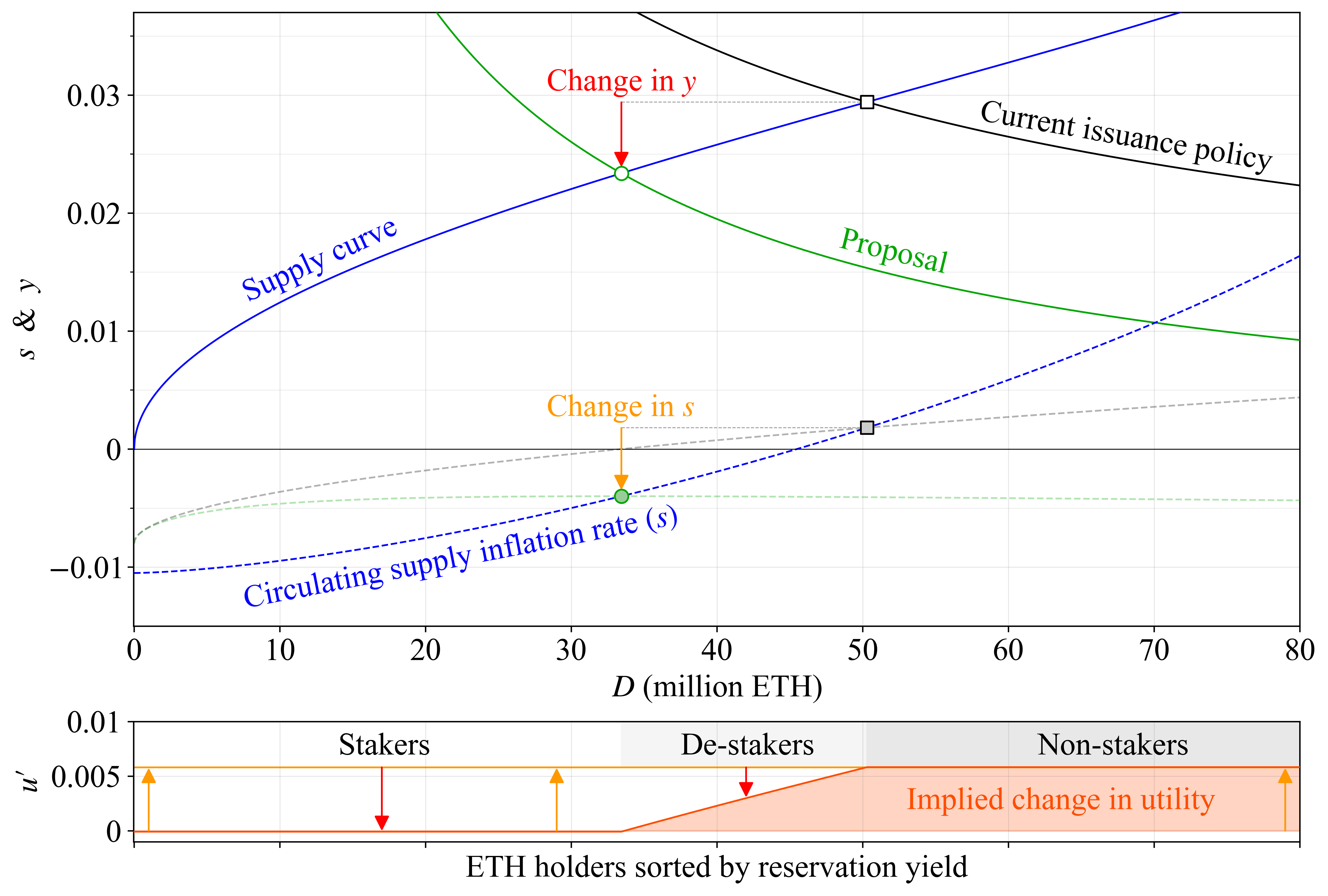
As mentioned, when a staker's yield $y$ increases, they attain a higher proportion of the circulating supply (non-stakers always have $y=0$). When $s$ goes up, everyone attains a lower proportion (due to more new tokens being printed). To determine how everyone is affected, we [simply calculate](https://notes.ethereum.org/@anderselowsson/MinimumViableIssuance#Benefits-of-MVI-to-user-utility) the proportional yield (also referred to as [real yield](https://ethresear.ch/t/endgame-staking-economics-a-case-for-targeting/18751#real-yield-the-real-deal-10))
$$
y_p = \frac{1+y}{1+s}-1,
$$
and compare the result at the square and the circle (the two different staking equilibria), accounting for the fact that de-stakers are unaffected after de-staking. The comparison reveals the utility change $u'$ for all parties, as shown in the bottom pane of the figure below. The orange arrows in the bottom pane illustrate how a reduction in $s$ increases utility for everyone---that's from removing the dark grey and dark blue areas in the first figure. The red arrows illustrate how a decrease in yield reduces utility for stakers, corresponding to the height of that dark grey area in the first figure. For the de-stakers, the red arrows become very short as that dark grey area narrows, even though they forfeited all yield. That's because their costs went to 0 as well. As a result, welfare has improved for Ethereum's users. The aggregate $u'$ here is based on the size of that removed dark blue region from the first figure, representing costs.
## Let the best money win
What happens when we impose unnecessary costs on our users? Imagine you live in a country that introduces two competing currencies: Money A and Money B. To keep it simple, both are initially valued as ETH, with calculations in euros. Money A adopts the following policy: it will reward you with €13 for each unit you held over the year (reflecting deflation from that green filled circle above). Great deal right? Money B instead decides to charge a fee amounting to €6 (reflecting inflation of the grey filled square).
You can use the magic of cryptography and some neat mechanisms to hold both currencies without any intermediaries. The money really works best this way, you can pay with it, rely on it, pass it around to whomever you like; everyone accepts it. Alternatively, you can also trust a bank with your money. The bank gives you €75 for depositing Money A (green circle) and €94 for Money B (grey square), before fees amounting to around 15-25 %. They [issue a redeemable certificate](https://mirror.xyz/barnabe.eth/v7W2CsSVYW6I_9bbHFDqvqShQ6gTX3weAtwkaVAzAL4) that you can use as alternative money in the meantime, and some have developed various neat functionalities to minimize the risk that they destroy your money, or steal it, or accidentally blackmail you into giving some up (but who knows, in this country, perhaps nothing is foolproof). Citizens have differing views regarding risks and utility of non-banked native money, so some might assign a cost of €30 for banking each token, while others might view the cost as high as €150.
To avoid the fee and the need to trust the bank to be nice and good, you can also run your own micro-bank (that would be a solo staker). Some people can do so rather efficiently and it will cost them only €30 per token all things considered, whereas others would need €150 to run their own bank.
Three citizens now need to decide which money to use:
* Citizen S (staker) only assigns costs of €30 per token for banking. Whether they run their own bank or not is a separate but important topic discussed in [Section 4.2](https://ethresear.ch/t/reward-curve-with-tempered-issuance-eip-research-post/19171#h-42-equilibrium-yield-and-the-proportion-of-solo-stakers-23).
* Citizen D (de-staker) assigns costs of €90 per token to banking.
* Citizen N (non-staker) assigns costs of €150 per token to banking.
The following table shows how their choice of money will affect them, ignoring any taxes or fees that the bank charges, but including costs the user assigns. When a citizen decides to not bank their money, they get a 0 in that field.
| | Citizen S | Citizen D | Citizen N |
| -------- | -------: | -------: | -------: |
| A base | $13$ | $13$ | $13$ |
| A bank | $75-30=45$ | $0$ | $0$ |
| **A Sum** | $58$ | $13$ | $13$ |
|
| B base | $-6$ | $-6$ | $-6$ |
| B bank | $94-30=64$ | $94-90=4$ | $0$ |
| **B Sum** | $58$ | $-2$ | $-6$ |
|
| **A $-$ B** | **$0$** | **$15$** | **$19$** |
### Which money would you choose?
Examining the difference between the two currencies: A $-$ B, it is clear that Citizen N and Citizen D should choose Money A. Citizen D did indeed gain a little from banking with Money B, but their costs are pretty high, so they end up at a net loss by year's end. What about Citizen S? The outcome is the same for them under both scenarios (58), so the choice does not seem to affect them (as also indicated by $u'$ in the previous figure). However, if this country imposes taxes on nominal banking income---as many do---then under most tax regimes, Option A with a tax on €75 will still be better than Option B with a tax on €94. The same effect applies if the bank levies a percentage fee on the staking yield. Truth be told, some banks may very well keep the fee the same in terms of €, because they have to do the same work. Or they might even charge a higher fee in terms of € if they must amortize costs for running the bank across a smaller customer base. But that could actually be pretty okay, because then self-banking becomes more favorable, and it turns out that this is good for the money.
But let's set aside banking fees and taxes. Will it then be just as wise for Citizen S to choose Money A as Money B? The outcome should be the same right? The answer is a resounding no! While Citizen S appears unaffected according to the table and previous figure, their total return is still influenced by the choices of all non-banked and de-banked citizens. With the adopted policy of Money A, demand for it will rise (all else being equal), and it stands to reason that this money therefore will become more popular and thus more valuable than Money B over time. A money that imposes lower costs on its users inherently holds greater value. Citizen S should therefore not only consider their own banking and base rewards (the attainable proportion of the circulating supply). He or she should also consider the proportion of the economy that the money will power.
## How the supply curve affects stakers
Hopefully, this discussion has convinced stakers that by reducing costs, all ETH holders can benefit. Still, they might be a little suspicious, because there was only one specific hypothetical supply curve in the example. Perhaps stakers might gain under a different one (at a potentially greater loss for non-stakers)? It's true that the shape of the supply curve matters in this regard. Stakers benefit from an issuance increase under steep supply curves where no new stakers enter if the yield $y$ goes up. Stakers do not benefit under flat supply curves where a slight bump to the yield makes a ton of new stakers enter, creating circulating supply inflation $s$ in the process. Remember that the proportion of the circulating supply that stakers can attain is what matters, not the staking yield. It is therefore essential for stakers to understand how the proportional yield of that previous equation $y_p=(1+y)/(1+s)-1$ varies with yield and stake participation. In economics, it is common to use diagrams to illustrate trade-offs by drawing lines along which conditions remain constant, similar to contour lines on a topographical map indicating equal elevation. This figure shows such a map, with "isoproportion lines" indicating where $y_p$ stays the same. It is drawn according to the equation in [Section 4.4](https://ethresear.ch/t/reward-curve-with-tempered-issuance-eip-research-post/19171#h-44-the-isoproportion-map-28), using the same MEV and burn rate as previously.
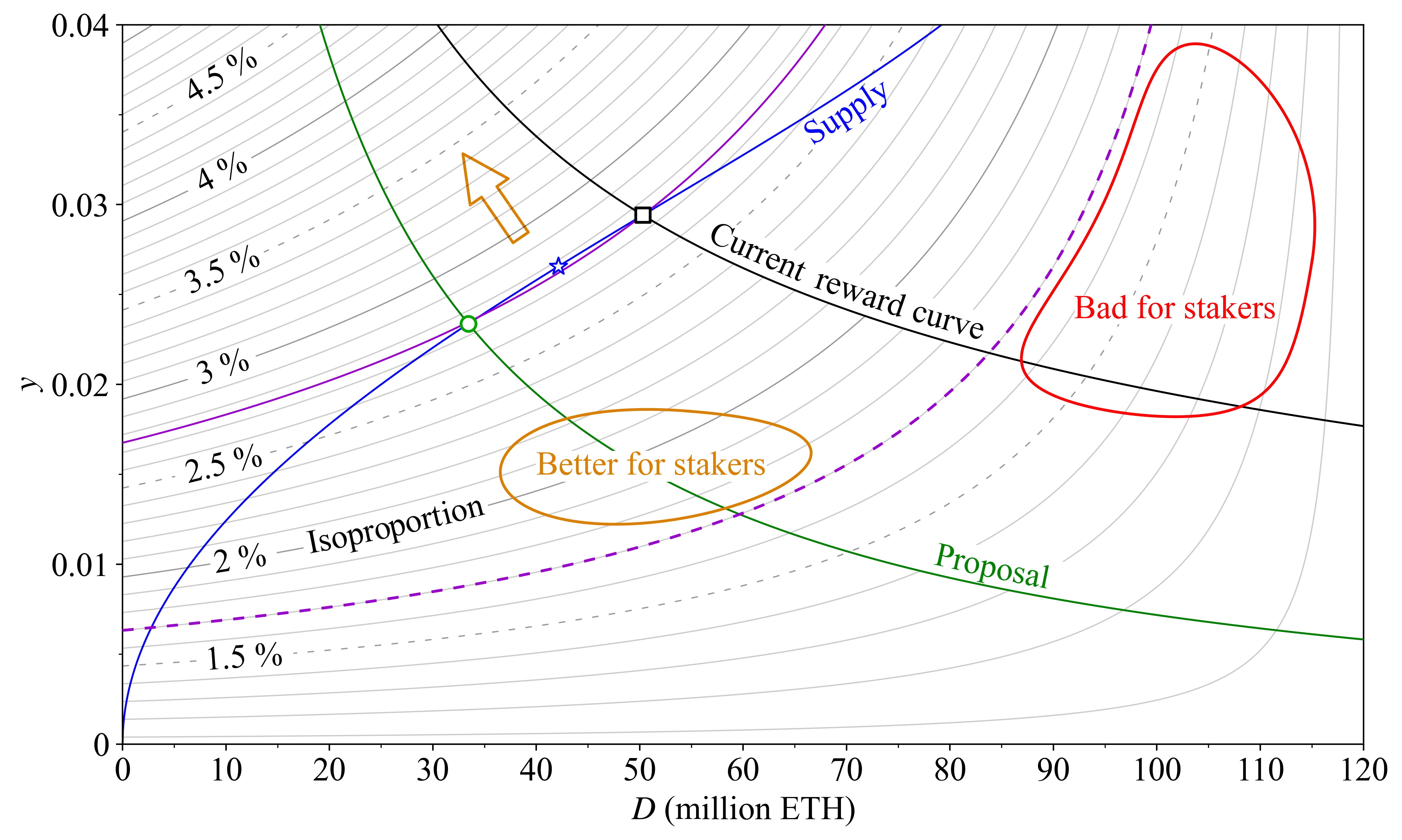
Let's start by looking at the purple dashed isoporoportion line. Stakers get a proportional yield of 1.7 % anywhere on this line, although the staking yield and stake participation vary. The red region lies below the line, so ending up there is worse for stakers than ending up in the orange region above the line, even though the staking yield is higher in the entire red region than in the orange region. When nearly everyone stakes, the supply curve must be almost vertical for stakers to benefit from an increase in issuance yield, since the supply inflation rate will increase nearly as much. The orange arrow points towards higher elevation on the isoproportion map, and the ideal equilibrium for stakers lies in the top left corner. But unfortunately for stakers, an equilibrium must lie on the supply curve. Now look at the purple full isoproportion line. The hypothetical supply curve in blue from earlier figures intersects both reward curves (black square and green circle) along this line---the equilibria are thus at the same "elevation". This explains why stakers were unaffected in the previous discussion. The highest elevation of the supply curve is marked by a blue star, situated between the two equilibria.
How might the supply curve evolve going forward? Use your intuition to outline its shape and check where your imaginary supply curve reaches the highest elevation on the map (as marked by the star). That's where the reward curve should intersect the supply curve for stakers to gain the highest proportion of the circulating supply. However, we must also remember the lessons from the earlier discussion about Money A and Money B: stakers also gain by holding desirable money with low aggregate implied cost.
## Proof of stake and proof of work
As outlined, an essential aspect of minimum viable issuance is to reduce costs for users of Ethereum's native token. Under proof of work, every issued ETH represented a cost (as token holders did not receive them), and the premise therefore much easier to understand. Under proof of stake, issued ETH constitutes both cost and surplus, making the situation perhaps a little more confusing. With the current reward curve and present level of MEV, the staking yield is around 2.1 % at 90M ETH staked. Suppose this equilibrium is reached and that the cost and surplus are equal there (this would for example be a linearly rising supply curve in the first figure, or something construed when also accounting for taxes on the surplus). In this scenario, ETH holders will distribute 1.6 % of the circulating supply (including MEV given away), but only reclaim 0.8% in surplus. The aggregate implied cost to ETH holders of 0.8 % of the circulating supply over a year would be comparable to the cost borne by BTC holders for securing Bitcoin after the halving this week (ignoring miners' transaction fee revenue). What's worse, the user who needs to hold ETH for transacting on Ethereum would be disadvantaged at the full 1.6 %, when [around 0.4 %](https://x.com/weboftrees/status/1710710086610440587) could have sufficed, depending on the supply curve and the desirable stake participation ratio.
### Economic security and the macro perspective
Of course, a proof-of-work blockchain that excessively reduces costs (miner rewards) will compromise its economic security. Bitcoin's perilous security model is outside the scope of this post, but differences related to [economic efficiency](https://www.reddit.com/r/ethereum/comments/191kke6/comment/kh79gh1/) between proof of work and proof of stake are always important to keep in mind. In proof of stake, the stake participation ratio to a large extent defines economic security: it cannot become too small, necessitating a sufficiently high staking yield at low participation ratios. But as has been established in this post, it is important to remember that proof of stake also comes with costs to the users of the native token. Incentivizing stake participation beyond what is needed for security, through excessive issuance, risks undermining the inherent cost advantage of proof of stake.
Economic security is a nuanced topic, further explored in [Section 5.1](https://ethresear.ch/t/reward-curve-with-tempered-issuance-eip-research-post/19171#h-51-economic-security-30). There comes a point where the marginal increase in security from adding another validator brings less utility than the utility loss stemming from the numerous downsides of higher issuance. If an issuance policy impedes the native token's ability to uphold its value, economic security will diminish in the long run, irrespective of stake participation. This is underscored by reviewing [Vitalik's analysis](https://blog.ethereum.org/2016/05/09/on-settlement-finality) of Ethereum's economic security from eight years ago when the market cap of the ETH token was roughly 500 times lower than today. The market cap matters. Providing Money B instead of Money A in a competitive market can jeopardize economic security in the long run.
The supply curve may gradually decline over time. This would imply a lower aggregate cost for staking at an equal stake participation. The current reward curve will then compel stakers (including new entrants) to take on even higher aggregate costs than previously, if the general shape (not scale) of the supply curve stays the same (because the issuance level will increase). This is an unfortunate outcome for several reasons, not only because it is desirable to keep costs low. At a very high stake participation, security may start to degrade even in the short run. Ethereum ultimately [relies on the social layer](https://ethereum.org/en/developers/docs/consensus-mechanisms/pos/attack-and-defense/#people-the-last-line-of-defense) to uphold the intended consensus process in the case of misbehavior by dominant parties, such as one or several staking service providers managing more than 50 % of the stake. If everyone sees their ETH savings affected by an outcome, the social layer may lose its neutrality and credibility as the ultimate arbitrator. This "macro perspective" ([Section 2.2](https://ethresear.ch/t/reward-curve-with-tempered-issuance-eip-research-post/19171#h-22-macro-perspective-10)) is a very important interrelated reason for changing the issuance policy. This post did not seek to diminish it as a reason for pursuing minimum viable issuance, but to first simply establish very basic foundations, emphasizing that issuance policy is not a zero-sum game.
## Conclusion
Minimum viable issuance reduces aggregate costs, to the benefit of all ETH holders. This creates value and will over time help Ethereum uphold a high economic security. The push for a change to Ethereum's issuance policy is not about shifting value from one group to another. We can all win by enabling Ethereum's users to hold the native token without incurring costs for doing so, ensuring a [trustless](https://twitter.com/fradamt/status/1760808900792594593) asset within the ecosystem. We can all win by allowing ETH to grow in lockstep with Ethereum as the best money for any citizen of any country. We can all win by adhering to a principle that has been with us from the beginning:
*Minimum viable issuance*.